Sometimes in life you get what you pay for. Then sometimes you get WAY more than you pay for. The latter is the case with Roebuck Watch Co.
As a resident of Texas, I love checking out Texas watch brands. Last year, I got the chance to chat with Roebuck’s founder, Guy Roebuck. After seeing him at a couple of watch shows, I had the chance to check out the Diviso for a review. Honestly, I became a big fan of it. Let me show you my highlights and you can see for yourself.
Dial
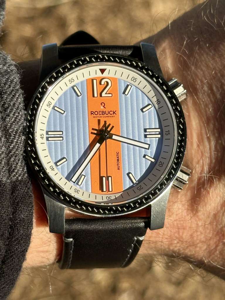
I love a watch that can hold its own versus more expensive watches. Such is the case with Diviso’s dial. The design is based on tin roofs that litter the Texas countryside. I completely see it, though it reminds me of a hot pinstripe dress shirt I once had (it was also blue). Either way, I love the texture. It offers just the right amount of shadows to keep the dial from looking 2D.
Between the two blue parts of the dial is an orange racing stripe. Roebuck’s logo and the word “automatic” are present on the orange. And that’s about it. The hour indices are simple lines with double-marks on 3, 6, and 9. The only large number displayed on the watch – 12 – is in bold white with a hint of a silver outline. The white minute and hour hands mimic the hour indices, also including silver outlines, though the seconds hand features a red tip.
Bezels
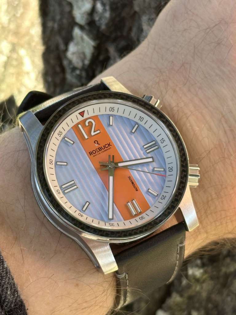
The inner bezel displays 5-minute increments and is adjustable with the second crown featured at the 2 o’clock mark. That bezel features a shiny red inverted triangle at the 12 position. Just outside the inner bezel is one of my favorite features on the watch – a thin carbon-fiber patterned outer bezel sandwiched between stainless steel. The patterns of this timepiece complement each other beautifully, and the simplicity of the watch prevents it from looking too busy.
Simplicity
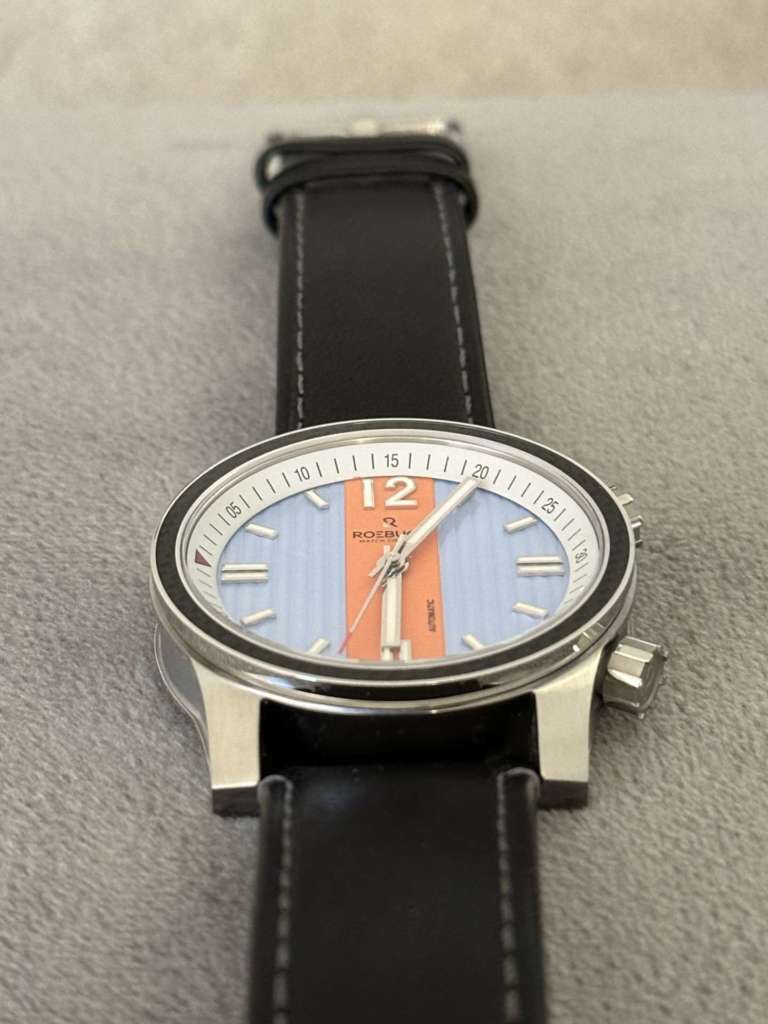
Speaking of simplicity, let’s touch on that briefly. I usually prefer more complicated watches but the Diviso’s simplicity has grown on me. I love the power of the line “12” digits on the dial, as well as the simple hour indices. The fact that there are no subdials or date windows blocking the view is a rarity nowadays. There’s just something about this watch that helps you focus on the more straightforward parts of life. But I digress…
Racing motif
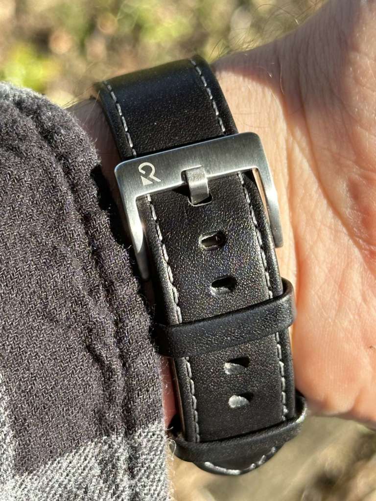
One undeniable aspect of this watch is its roots in racing. The orange racing stripe, bold number 12, and white stitching on the sides of the black leather strap all subtly point to it. I use that word – subtly – on purpose, as this is not an “in-your-face” racing watch. Those are starting to flood the watch industry but subtle nods like this remain all too rare. This is the perfect timepiece to declare your love for racing fashionably.
Case
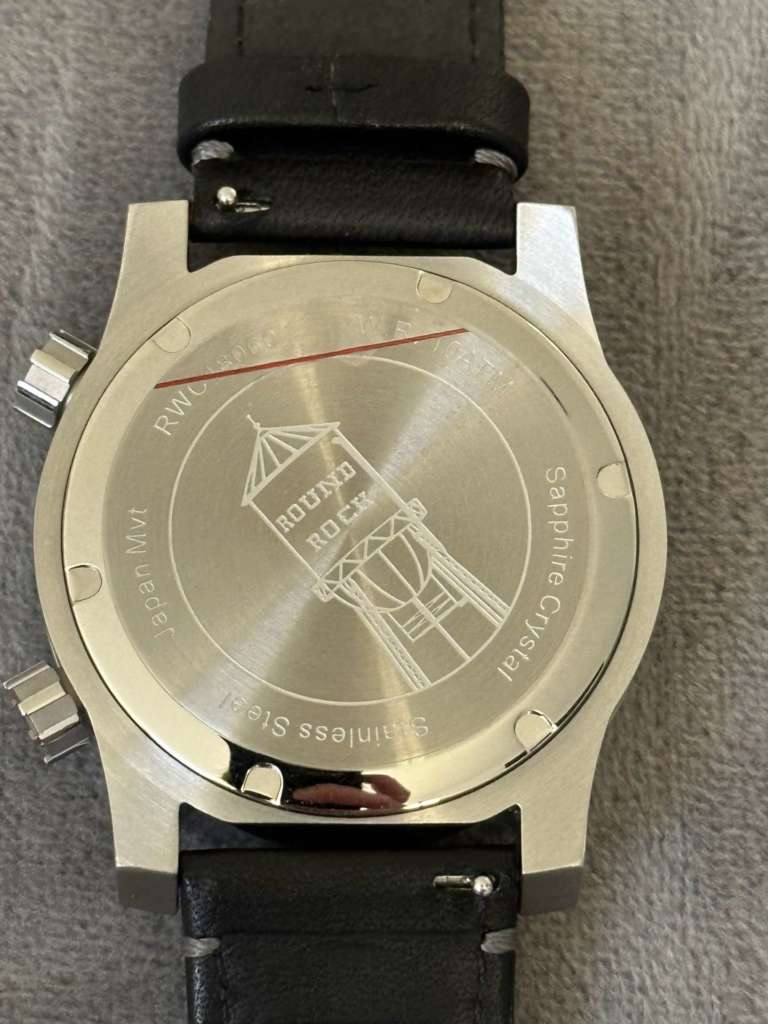
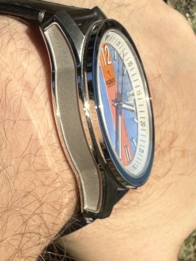
I love a watch that breaks the mold with its case and this watch does so – again subtly. Notice the carve-outs or indentations on the left and right side of the watch – not something you see every day. While most watch companies would use that prime real estate for branding, Roebuck maintains its emphasis on simplicity and leaves it alone.
Overall
I wore the Diviso for longer than I should have, as I immensely enjoyed the experience. Diviso is comfortable, durable, and easy to read on the wrist. The luminosity is good, done smartly on the white numbers, hands, and indices. Part of the watch’s comfort is due to the dual crowns at 2 and 4. This is the first timepiece I’ve worn for an extended time without the crown at 3 or 9 – I must confess, this is a worthy feature.
Honestly, the only opportunity I found for Diviso was that the crown at the 2 o’clock mark ends up moving with normal wear throughout the day. This may cause the inverted triangle at 12 to be anywhere around the watch. It’s a super minor issue, but I’m that guy who always resets his bezels to 12 o’clock (the way they should be).
Roebuck is a young company with a bright future. Their Diviso watch is overall a well-designed watch at a great value. Check it out for yourself here.